TEA HOUSE COLLECTION

PEPSI LIPTON PARTNERSHIP

PLTHC_TOAST.jpg

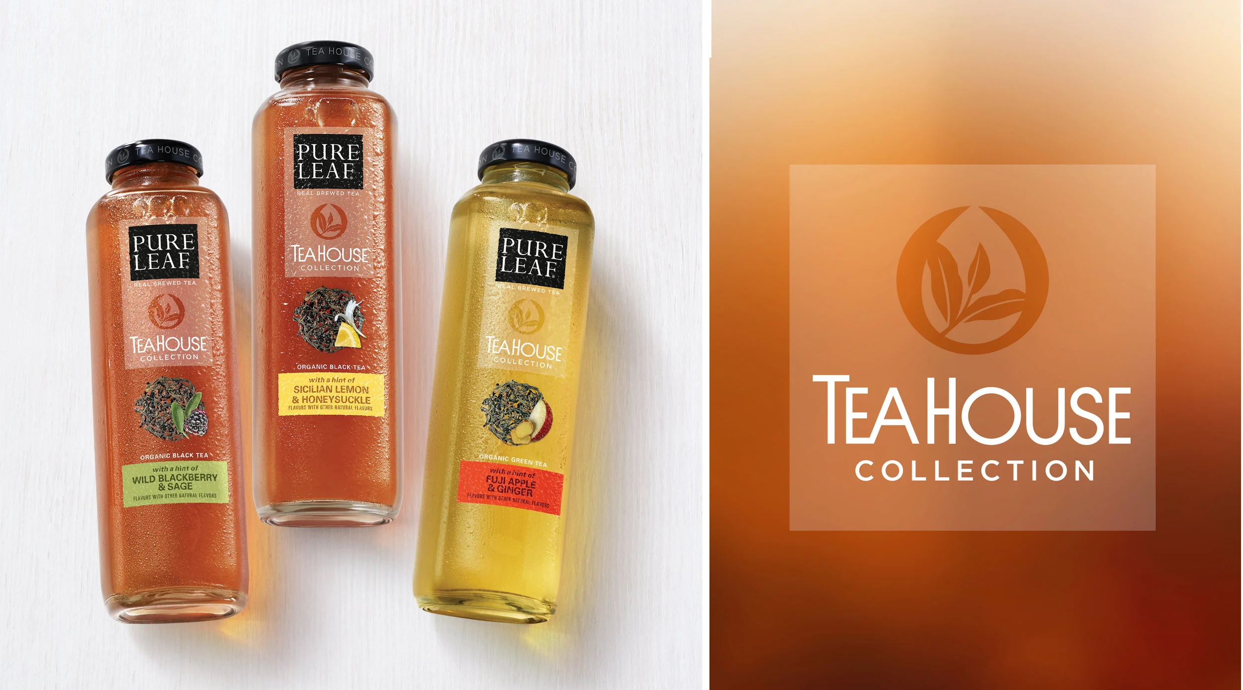
A “TEA house in a bottle” was the inspiration for the visual identity created for a super premium line of Pure Leaf Iced Tea. THE TRI-LEAF REINTERPRETED AS AN ICON helPs reinforce a premium aesthetic.

a proprietary bottle shape worthy of a tea house plays a vital role in telling the tea house story.

Scope included graphic and structural design.

Screen Shot 2018-09-05 at 4.45.40 PM.png

A Culinary aesthetic and Artisanal ingredients are featured on Packs designed specifically for the club channel.


PURE LEAF MATCHA

UNILEVER

matcha powder leaf.png
 

The vivid beauty of Pure Leaf Matcha powder was the inspiration behind the creation of the matcha tri-leaf.

PLMatchs_toast_jars.jpg


PURE LEAF, LEAF TEA

Unilever

Pure Leaf DIY.png
 

“Celebrate the TRI-leaf” and Romanticize each blend and place of origin werE our goals in creating an identity for Pure Leaf, leaf tea.

A SERIES OF ORIGIN INSPIRED PATTERNS AND STAMPS WERE developed TO ESTABLISH AUTHENTICITY AND ENRICH THE ORIGIN STORY.

 
Pure Leaf DIY food service.png
 

The design was adapted for the food service channeL and is offered in easy to dispense structures with matte and gloss detail. 


MYLICON PROBIOTICS

INFIRST HEALTHCARE

 
Mylicon probiotic_r3.jpg
 

We are all smiles about the launch of infants’ Mylicon. THE VISUAL IDENTITY LEVERAGEs BRAND EQUITIES and communicates to parents in a credible and reassuring tone-of-voice.


CHILDREN’S MYLICON

INFIRST HEALTHCARE

 
childrens_mylicon_wCharacter.png

kid-friendly and parent-approved! The Mylicon Tummy Relief character was developed to represenT friendship with a dose of light-hearted comfort.


GOODBODY BAKED GOODS

Goodbody Inc.

GBBG_Toast_product.jpg

The re-branding of goodbody baked goods embodied a wholesome spirit of upbeat goodness. OUR GOAL WAS TO REINFORCE The Essential Goodbody truth: gluten-free can be delicious and enjoyable.

10_22_13_GoodbodyBakesGoods_04.jpg
goodbodyTs.png

promoting the Goodbody spirit far and wide was a feel-good mission For the toast team.


PAQIT TOWELETTES

PAQIT INC.

paqit.jpg
 

Establishing Paqit as a modern cosmetic company committed to providing "clean skincare" for an on-the-go lifestyle was Our goal in creating thE identity.

 
Screen Shot 2018-09-17 at 4.34.22 PM.png

The brandmark features clean and honest letterforms and an elevated “i” to reinforce the idea that you can take “Paqit” with you.


THE CHILDREN'S LEARNING CENTER

CLC_Roof_R2.png

The Children’s learning center is FULL of possibility, learning anD wonder. The visual identity was designed to communicate a sense of place and friendly accessibility.

CLC logos-02_reduce.png
 
CLC_sense of place_kid-05 copy 2.png
CLC_sense of place_kid-05.png


DILENA DOLCINI

DILENA

AN IDENTITY FOR A REGIONAL BRAND UNITES THE NAME,DILENA, IN CLEAN LETTERFORMS, WITH DOLCINI, THE ITALIAN WORD FOR SWEETS. A VIBRANT AND DELIGHTFUL ILLUSTRATION OF TOWERING DOLCINI ACCOMPANIES THE WORDMARK.

A RADIANT RED SYSTEM FEATURES A COLLECTION OF GIFT-READY PACK STRUCTURES,AN ASSORTMENT OF FESTIVE TAGS, RIBBONS, STICKERS AND A GRAPHIC ACCENT INSPIRED BY DILENA’S SIGNATURE COOKIE, THE RAINBOW NONPAREIL SPRINKLED DOLCINI.

 OKO FROZEN YOGURT

yokoid.png

A STRONG CULINARY FOUNDATION SET OKO FROZEN YOGURT APART FROM THE COMPETITION. WE ADDED A BIT OF SOPHISTICATED WHIMSY AND CREATED AN IDENTITY THAT IS ACCESSIBLE AND FUN.

instore1.png

Scope included store graphics and team building material.

OKOpromotional.png
 

 FERIA

L´OREAL SALON DIVISION

betterferia.png

EXPRESSIVE HAIR COLOR DESIGNED FOR A NEW GENERATION OF EMPOWERED INDIVIDUALS.

 AQUAVIT SKAFFERI

RESTAURANT AQUAVIT

Aquavit2.png

"Skafferi,” the Swedish word for "pantry,” is a fitting sub-brand name conceived by Toast for this collection of Swedish specialties marketed by THE famed Manhattan restaurant Aquavit.

An abstracted image of water created to represent the waters surrounding Sweden is the focal point of the identity designed for Aquavit Skafferi.